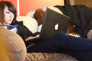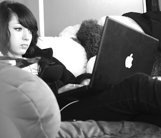
For the edited version of this photo I turned it black and white. Then I burned some of the shadows and I dodged some highlights and mid-tones. Also, I think I chose this photo in black and white because of the contrast of darks and lights. Though I like the colors of the color photo. It could be along the lines of technology. The angle this was taken I thought worked out well for a paparazzi photo.
Edited Burned Dodged:

Original Photo:

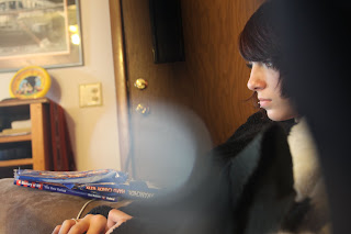
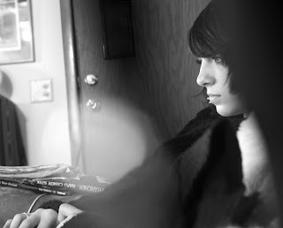
For this edited photo, I turned it black and white. Then, I burned the mid tones and some of the shadows. Next I dodged the highlights and I think some of the mid tones as well. I chose that I like this photo better in black and white. Her and her face stand out on both of these photos. Thats not the only reason. The contrast of darks and lights are noticeable. I tried to burn out that big light coming in to try to get rid of it. But it really doesn't take away from the photo. Either way, I like this photo.
Edited Burned Dodged:

No comments:
Post a Comment
Note: Only a member of this blog may post a comment.