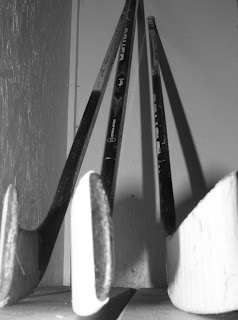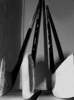
This is the photo that I edited. I changed the levels of the picture so that it turned out darker. I also burned the sitcks so they would be darker, which I thought made them stand out more. Then I dodged the white letters and scratches on the sticks so they popped out more. I also on the wall to the left I burned that to be darker. I think after the editing this picture turned out a lot better and isn't as washed out and plain as the original was.

No comments:
Post a Comment
Note: Only a member of this blog may post a comment.