 I like the color one better because I like how all the colors connect. I like how the lights reflect off the hard wood floor.
 I like the color one better because I like how all the colors connect. I like how the lights reflect off the hard wood floor.
 I really enjoy the black and white one better because to me it looks more motivating. there is less colors and so it just focus on the word believe. I really like the pattern in the counter with the refection.

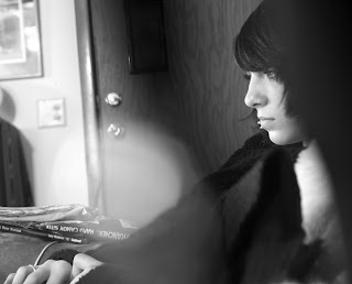
 First thing I did with this photo was to turn it black and white. Then I adjusted the levels and cropped it to take out some of the information I thought wasn't necessary. After that some of the darks got dodged and some of the lights for burned. You can't really tell that I burned and dodged it though.


 The photo's that I chose worked well for both the assignment and my topic for the sketch book.


 Didn't have room to put the original photo, but I converted the photo to black and white. Then cropped the far right side out.


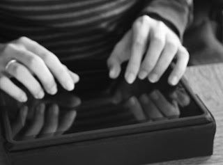
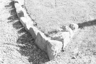
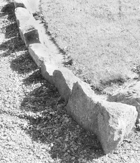
 I converted this photo into black and white from the original, then adjusted the levels of the photo. I then cropped the topper half of the photo. What I like the most out of this photo is the reflections that I was able to capture.
 I dodged and burned the bottom photo in Photoshop to make the front corn stock stand out the most, and the ones behind it fad out.


 I like this color photo better than the black and white one because I believe the rust on the nails stand out better. Even though the black and white makes it look more old, I prefer the color photo the best.
 I like the black and white one better because the leave stands out. This picture shows the leaf is dead but still holding on to a piece of wood maybe not wanting the season to change.


