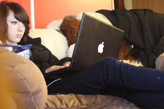
On this photo I cropped part of the top and right side of the photo. After that I turned it into black and white. Next, I dodged some of the highlights and the midtones. The seasoning containers got dodged a little and little part of the cup in the foreground.
Then adjusted the levels a little. Finally, I dodged part of the chair and the table a bit. I liked this photo a lot because its what my daily workspace usually looks like. I thought that the setup of the objects were good as well. This is a good example of a diaristic or autobiographical still life.


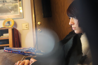
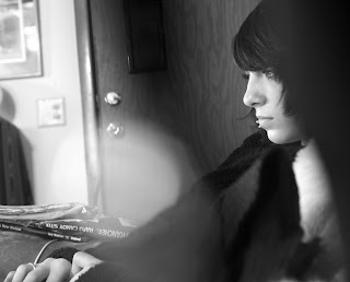
 I like the black and white one better because the leave stands out. This picture shows the leaf is dead but still holding on to a piece of wood maybe not wanting the season to change.


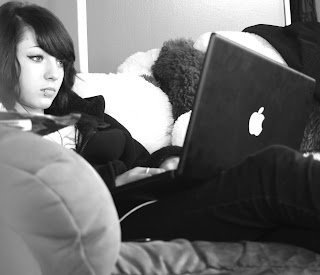
 First thing I did with this photo was to turn it black and white. Then I adjusted the levels and cropped it to take out some of the information I thought wasn't necessary. After that some of the darks got dodged and some of the lights for burned. You can't really tell that I burned and dodged it though.


