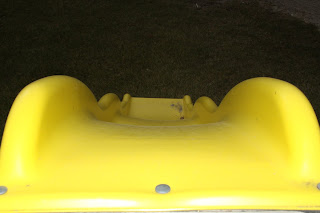
I choose this picture because it has solid lines and was a good use of thirds. The picture on the top was cropped down to remove the emphasis on the background. I also adjusted the highlights and shadows to bring out more of the yellow in the wheels and frame. This also goes with my theme of the "grey side of life".
Welcome! This blog is in place to provide the students of NCTC's photography classes a forum in which to submit their work, and receive feedback from fellow students, the instructor, and other online guests. Critique comments must be constructive in nature, and any mean-spirited or offensive comments will be deleted.
Monday, October 31, 2011
Old Train Carts
I choose this picture because it has solid lines and was a good use of thirds. The picture on the top was cropped down to remove the emphasis on the background. I also adjusted the highlights and shadows to bring out more of the yellow in the wheels and frame. This also goes with my theme of the "grey side of life".
Thursday, October 27, 2011
Hockey
Train
Eiffel Tower

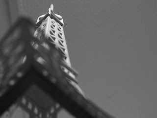
This is the edited black and white photo of the original one in color. I really thought that the lines were a great thing. Also I like the angle that I took it from and how it talks about lines and structure. One thing I did to the photo was crop part of the right side of the frame. The reason for this was that I didn't need some of that information. The black and white was boosted a little. Because I didn't really like the tone that it was before I changed it.
Original Photo:

Wednesday, October 26, 2011
Subscribe to:
Comments (Atom)


